
Introduction
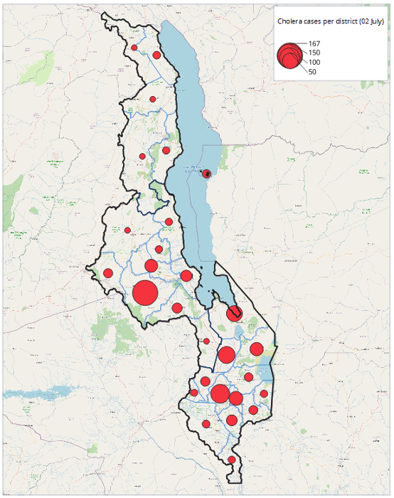
This tutorial introduces how to create proportional circle maps in QGIS, and how to create a suitable legend that does not take up valuable space on a map page. It will use the example of cholera cases per district in Malawi. The final product will look like the map image to the right. In this tutorial the cholera cases from 02 July in admin 2 are vizualised.
What you will need
- Malawi cholera cases .CSV file
- Malawi admin boundaries shapefiles (admin level 0, 1, 2)
- QGIS downloaded on your computer
Getting started
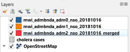
- Open the shapefiles in your QGIS project.
- Add the .CSV file as a layer. When adding the .CSV file, do not drag and drop it into the layer box. You must use Layer > Add Layer > Add Delimited Text Layer for the join to work properly later on.
Tutorial
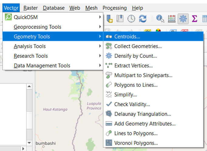
1. Create a shapefile containing the centroids of each of the admin areas
To create a proportional circle legend, as per this tutorial, the polygon shapefile of the admin level shapefile will need to be converted to a point (centroid) shapefile. In this tutorial this is admin level 2
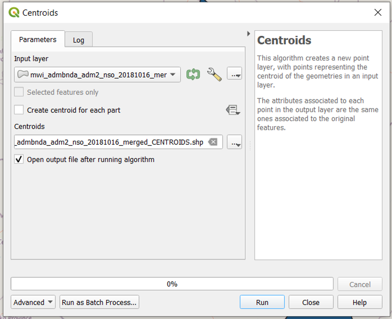
A centroid shapefile is created by navigating to “Vector > Geometry Tools > Centroids”. This geoprocessing can also be completed by navigating and searching for “Centroids” in the “Processing Toolbox”.
This new shapefile is saved in the same folder as the original and “_centroids” is added to the existing filename. This will mean that it will be next to the original shapefile in the File Explorer. If the file is likely to change, a date can be added to the file name.
2. Join the data to the centroid shapefile
Next the CSV data, the cholera cases, is joined to the newly created centroid shapefile. This is completed by right clicking the new centroid shapefile and selecting “Properties”, then “Joins > +”. The join layer is the CSV and the join and target fields will be the admin PCode. In this example, this will be admin level 2. Click “OK” in the Joins dialogue box and then “OK” in the “Properties”.
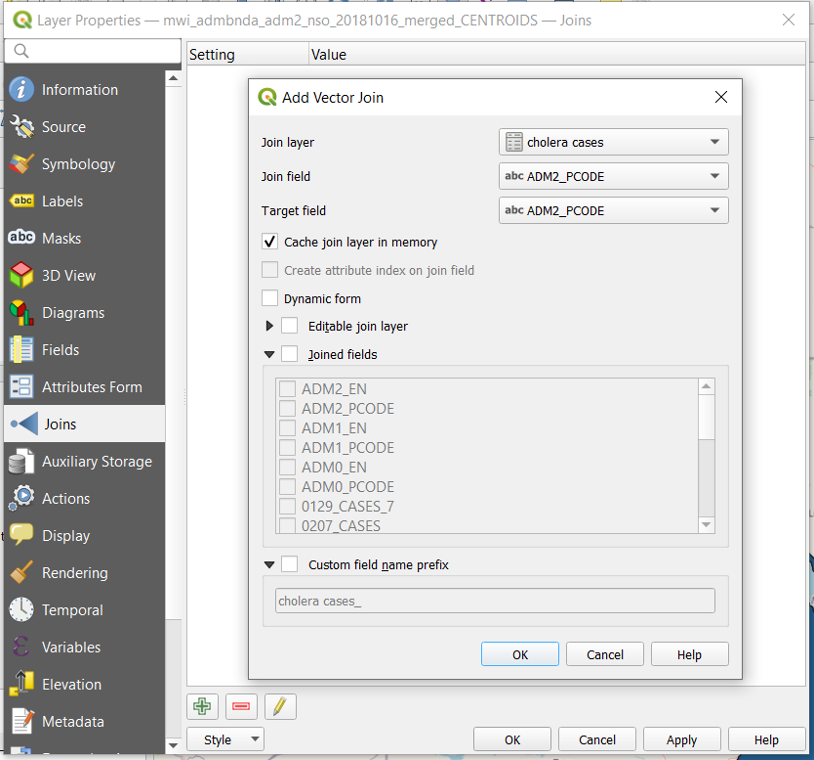
Check to see if the join has worked. Right click the point shapefile you joined the data to, and click “Open Attribute Table”.
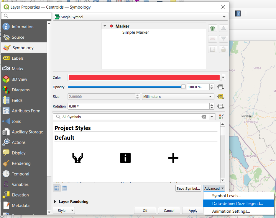
3. Symbolize the centroid shapefile with the joined data
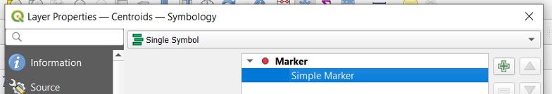
Once the data is correctly joined, it is now possible to create proportional circles for the admin level 2 areas, representing the cholera cases. Navigate back to the properties dialogue box of the centroid shapefile and go to “Symbology”.
In Symbology make sure it is a “Single Symbol”. In the top panel under “Marker”, Click “Simple Marker” Change the color and style as per the style that is required.
Next select the “Data Defined Override” button to the right of “Size”. Select “Assistant”.
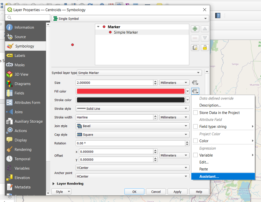
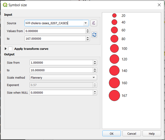
This opens another dialogue box called “Symbol Size”. In the first field select the data “Source”, this will be the data that is to be visualized. In this example the Cholera Cases from 02 July are visualized, so this column is selected. Click the “refresh” button under in the next row, this will populate the smallest and largest fields to be visualized. The output size is then chosen, from the smallest size to largest. Keep all other fields as they are. Click “OK”.
Back in the Symbology tab in Properties, select “Marker” at the top of the dialogue box. At the bottom of the dialogue box click “Advanced > Data-defined Size Legend”.
By default the legend is not enabled. As we would like a legend in our map, select “Collapsed legend”, this will create a legend with proportional circles within one another, saving valuable map and legend space. Change the “Title” to a space, as otherwise the title of legend will have the column name of the field in the attribute table. QGIS will automatically create the legend classes, however, there is the ability to create your own classes by selecting “Manual size classes”.
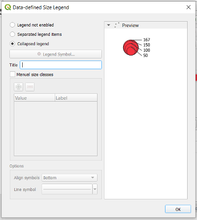
Click “OK” and then “OK” again to close the “Properties” dialogue box. This will return you to the map.
The map in the map viewer should now have proportional circles. You can now style the map to be as you would like.
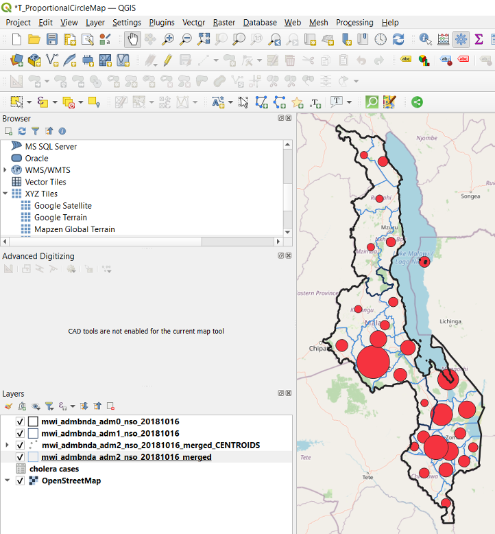
When you now add the legend to the map layout, the proportional circles legend item should now be displayed as you defined in the “Data-defined size Legend” dialogue box.
