
Introduction
We run a weekly drop-in surgery space where anyone in the organisation can come and get an introduction to what our team does or to ask us a question. The questions range in topic across the GIS & Information Management spectrum — from how to make a map, to how to complete a primary data collection project using mobile data collection tools, to advice on data analysis planning, to visualising analysed data in a product for an end-user to use to make a decision.
As the organisation’s data literacy and data appetite has increased, we’ve seen a corresponding increase in the appetite for people to produce their own interactive data visualisations.
As with many large organisations, the British Red Cross uses lots of Microsoft tools. Accordingly, PowerBI has emerged as the main tool being used internally for data visualisation (at least, from our point of view).
Although our team has a collective knowledge of data visualisation for humanitarian response, which sometimes includes making PowerBI reports, we don’t claim to be experts compared to some other internal teams using the tool.
However, what we are experts in is maps, so it seemed pertinent to give an overview of some of the different options for using maps in PowerBI.
Caveats & Compromises
The caveat here is: PowerBI is not a GIS. The maps you can make are fine for a quick visual of a simple geodata layer but if your data are inherently spatial or you are wanting to show a higher level of geographic complexity, accurately and consistently, I’d strongly recommend using a dedicated GIS tool such as an ArcGIS Dashboard.
You can read a full overview of the pros and cons of each visual below, but in summary: if using PowerBI is the only option for you then, in my experience, the map visual that I use most often is the Shape Map. I think it is the sweet spot in terms of functionality vs complexity vs end user experience, in comparison to the other options available.
Map and Filled Map are too simplistic and only seem to reliably work for data related to North America and Western Europe which, for a humanitarian, is basically useless.
At the other end of the scale, ArcGIS Maps for PowerBI and Mapbox Visual provide a whole bunch of customisations and functionality that goes well beyond what PowerBI provides natively. However, I’ve yet to come across a situation where I wanted that level of map complexity, but yet didn’t want to just use a dedicated GIS. I have also yet to see a report using either of these visuals, that wasn’t produced by either ESRI or Mapbox. I remain an open-minded sceptic on the utility of either of these two latter visual options.
Shape Map allows you to create a dashboard with a good enough map in it, without straying too much into what a GIS is for.
Read on for an in-depth look at the 5 different map types that you might consider using in your report, or jump to a specific section here: Map, Filled Map, Shape Map, ArcGIS Maps for PowerBI, Mapbox Visual.
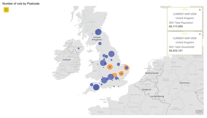
Map
First up is the esoterically named “Map” visual. This allows you to display point data on a Bing map and colour the points based on a category value in your data (e.g., “disaster type” or “colour”). You can alter the size of the points based on a numerical value in your data (e.g., “number of volunteers” or “number of distributions”) and change the base map to one of five different options.
Example
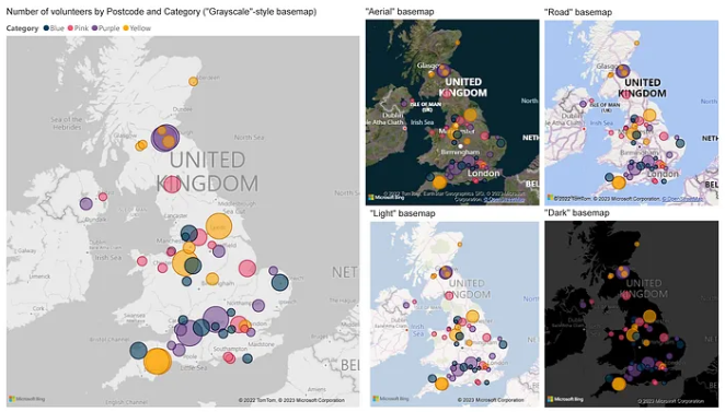
The example below shows a greyscale base map overlaid with 50 points, geolocated from a postcode in the standard UK format. The points are coloured by a category, in this case “colour” and they vary in size in relation to a number of something at each point, in this case “number of volunteers” (remember: this isn’t real data).
The other maps in this image display the same data, just shown over the different base map style options.
Advantages
- your point data can be either a latitude/longitude coordinate pair, or a postcode that automatically geocodes using the Bing Maps Geocoding service
- the map is really simple and implementing it is fairly self-explanatory (in fact, Microsoft don’t provide any documentation for this visual at all, so hopefully it is self-explanatory for you…)
- you can choose between five different base maps
- displaying a map on a report page doesn’t require any additional data manipulation, nor access to another tool or service (more on this later)
- a user can filter/slice data in other visuals on the page by clicking on the map, and vice versa
Disadvantages
- only visualises point data
- only visualises a single data layer at a time on the map
- the geocoding process uses the Bing Maps Geocoder. There is limited documentation available from Microsoft that explains the Bing Maps Geocoder process and the confidence level of the results it produces
- depending on the country in which you are working, the ability of this geocoder might be limited (e.g., if you are trying to geocode an address from somewhere in Africa, you may have less luck than if you were geocoding an address in Western Europe)
- in order to geocode, your postcodes are sent off to the Bing Maps Geocoding Service, plus anything you have in the latitude and longitude fields. This may be a problem for you if your data is sensitive. There is more information on this here and here
Filled Map
Allows you to make a choropleth map (a map with different areas coloured to show variation in something over geographical space), using the Bing Maps Geocoder to locate the areas. The colours can be categorical (e.g., “yes or no”) or numerical (e.g., “number of volunteers per county”) and you can change the basemap to one of five different options. See this documentation for how to make a Filled Map.
Example
The example below shows four maps:
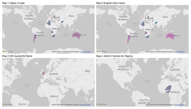
- Map 1: mapping 25 countries using their ISO3 country codes and displaying the sum of a random value
- Map 2: mapping the same data using the English language country short name
- Map 3: mapping total land area for a selection of UK Counties and Unitary Authorities, based on their English language name
- Map 4: mapping made-up population size for a selection of Nigeria admin 1 areas, using their English language name
Advantages
- it is possible to summarise data by aggregating total values to an area, which is often a much more appropriate way to visualise data than by just showing lots of points on a map (as points can quickly start to obscure other points on the map, even with a relatively low number of points)
- a user can filter/slice data in other visuals on the page by clicking on the map, and vice versa
Disadvantages
The main issues with this visual are to do with Microsoft’s nebulous (lack of) documentation about how the visual and geocoder function, and the seemingly random inconsistency of the errors it produces.
Map 1: For mapping the ISO3 country codes for 25 countries, some of these codes are recognised correctly, however some are not. For example, the Aland Islands’ data is assigned to the US state of Alabama. There is no documentation describing how the geocoder recognises (or not) standard codes.
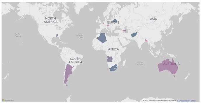
Map 2: Mapping the same data using the English short name for the countries instead appears to be more successful, however there is no information telling you which countries are mapped successfully and which are not. This method is also dependent on the geocoder’s interpretation of English-language place names.
Map 3: Mapping UK Counties and Unitary Authorities using their official names. Again, some of the geocoding is incorrect. For example, St Helens is located in Cambodia, rather than Merseyside and Oldham is located in the US State of Indiana.
Map 4: Some of the States of Nigeria are mapped successfully, however Rivers State is mapped in Canada.
Shape Map
Allows you to make a choropleth map (a map with different areas coloured to show variation in something over geographical space), using your own boundary data in a topojson format. The colours can be categorical (e.g., “yes or no”) or numerical (e.g., “number of volunteers per county”). See this documentation for how to make a Shape Map.
Example
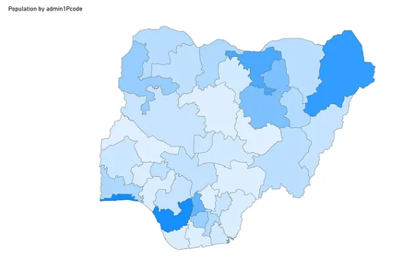
The map below shows a map of the States of Nigeria coloured by “population”.
Advantages
- you can choose to use your own boundary data
- you can match data to those boundaries using coding
- you can filter the content of the map using the same filters as you apply to the rest of the report, without the map panning or zooming
Disadvantages
- there is no base map to provide context for where your location is, so your map appears floating in a sea of whitespace
- you can only show one variable on the map at a time
- the tooltips always show the two data fields you’ve used to build the map, regardless of whether you want to show them or not
- in order to make this map, you are likely going to need a use a GIS-type tool to make a topojson boundary file to then import into PowerBI (unless you can find and download a reliable topojson file of your area of interest that already exists). In general, whenever I need to create a Shape Map I (a) get a boundary dataset in another format from Natural Earth/GADM/HDX (b) load into QGIS (c) export as geojson (d) use Mapshaper or Geojson.io to convert to topojson — this is a lot of extra steps using tools that may be even less familiar than PowerBI
- depending on the complexity of the geography you are displaying, you may find that the topojson file you use is quite large. It’s highly advisable to test whether your map works effectively in browser, once your PowerBI report is published to the PowerBI service, but prior to sharing your end product — you may need to create a simplified topojson file
ArcGIS Maps for PowerBI
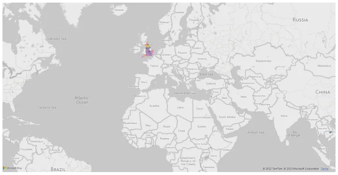
Allows you to add point, line and polygon data to a map and style based on attributes or spatial density. You can aggregate data by clusters, calculate drivetimes, add public data layers from elsewhere in ArcGIS Online, from the Living Atlas and from secure ArcGIS Organisations (like the British Red Cross!). See the documentation here and here for how to set up a map in this visual.
Example
The map below shows 50 points geolocated from a postcode in the standard UK format. The points vary in size in relation to the “number of volunteers” at each point and the orange polygons represent 39 minute drivetimes from 4 of the points. The basemap is styled using the IFRC Go Mapbox style (more details here) and there are two information cards showing data from 2 layers added from the ArcGIS Online Living Atlas — the data in each updates depending on area of the map in view.
Advantages
- a user can filter/slice data in other visuals on the page by clicking on the map, and vice versa
- a user can select data on the map using a lasso or rectangle select tool, so several locations can be selected at once and data summarised about the selection
- you can add multiple layers at a time from ArcGIS Online
- you can show a full web map, pre-prepared in ArcGIS Online, within the plugin, and overlay point data on to it, should you want
- you can choose any base map available in ArcGIS Online
- you can add infographic panels to the map canvas that pull data from the Living Atlas. The data changes depending on the extent of the map canvas
- you can calculate drivetimes and distance buffers within the map canvas (which, I assume [..?!], uses credits)
- you can “join” data from elsewhere in your report to spatial data shown on your map
Disadvantages
- it’s very complex to make work and the documentation is poor
- the complexity is present in the published version for the end-user, not only when building the report
- it feels like a beta
- there are weird artefacts within the plugin that occasionally appear and give a poor user experience, e.g., on some screens the menus go fuzzy
- most of the buttons are so small that they are virtually illegible
- you can “join” data from elsewhere in your report to spatial data shown on your map, but you can’t filter that joined data using the filters that apply to the rest of your report. You have to use the plug-in specific filter button to slice the data, which is confusing to the user.
- when preparing a visualisation, if you close the report and re-open it, there is no way to sign back into the plug-in using your account. You have to add another ArcGIS map into the report and sign into that to make the original work. The automatic sign-out time period seems to be completely random.
- Living Atlas data is fairly US-centric, and the quality of much of the non-ESRI curated data on ArcGIS Online is variable. (In it’s defence, the fact that you can add data this easily from a free, global-scale library is amazing, however what’s the likelihood someone is going to do that straight in PowerBI, without tidying it up in ArcGIS in the first place? I’m undecided)
- to take full advantage of all the functionality available in this visual you probably need to use ArcGIS Online to setup a data layer(s) or web map to then use in PowerBI. This of course then means having access to and understanding of a separate tool.
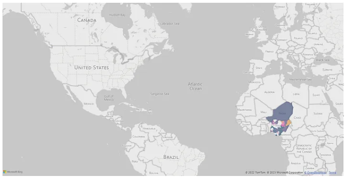
Mapbox Visual
Allows you to add vector-based heatmaps, point clusters, and graduated circles onto a map in PowerBI. You can add raster-based satellite imagery tilesets and/or tilesets generated from other raster data (using Mapbox Studio). You can search for locations using the Mapbox Geocoder and display the location as a pin on the map. You can create a custom basemap style in Mapbox Studio and use it in the visual. Take a look at this documentation for how to create a map using this visual.
Example
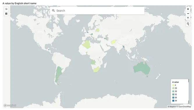
The map below shows mapping of 25 countries using their English language short name and displaying the sum of a random value.
Advantages
- a user can filter/slice data in other visuals on the page by clicking on the map, and vice versa
- the user interface within the visual is cleaner and more intuitive than in ArcGIS Maps
- you can use your own customised base map
- a user can search for a location using the Mapbox Geocoder and have a pin drop on the map
- a user can select data on the map using a lasso or rectangle select tool, so several locations can be selected at once and data summarised about the selection
- the Mapbox documentation for setting up the visual itself is fairly helpful and doesn’t use too much jargon, although there a several steps to take before getting to the map-making part (see below)
Disadvantages
- to initialise the visual you need to use a Mapbox API token. Generating a token is possible by signing up for a free Mapbox account, however the free account tier comes with a corresponding usage limit. Depending on your use case, you may find that the free tier is sufficient or not — there is more information on pricing here and on API tokens here
- much like the ArcGIS Maps for PowerBI visual, to take full advantage of all the functionality available you would need to make a map in Mapbox Studio and then import into the visual using a customised style URL — again, requiring access to and understanding of a separate tool
- there are fewer map tools and features available in this visual when compared to ArcGIS Maps, for a similar level of set up time
Conclusion
Hopefully the above is enough to get you started with the different maps available in PowerBI. If you are looking for more guidance then, as always, either send us a request for support or come for an informal chat at our weekly surgery space — the details for both are on our RedRoom page.