
Adding a terrain layer to maps is a good way to highlight landscape features that are hard to visualize with standard vector datasets.
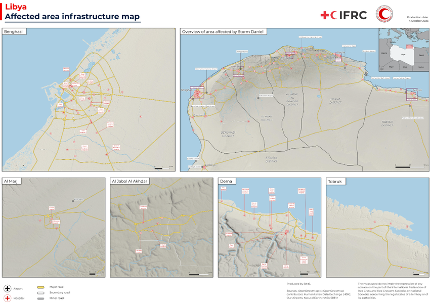
For example, in the map below for the 2023 Libya Storm Daniel flood response, visualizing terrain communicates important information that would otherwise be lost: which areas are on high or low ground? how large are the rivers? where might terrain be difficult to navigate, or travel take more time?
In ArcGIS Pro, a terrain layer is added as standard when creating a new map; in QGIS, you can add terrain layers from ESRI or MapTiler but as with other remote layers in QGIS, they only have very limited styling options. For example, you can’t choose render types other than singleband color, or set custom transparency values.
The best way to get a terrain layer in QGIS that you can customize and style is to build one from scratch using a digital elevation model (DEM) layer as the starting point. There are a few DEM datasets available but NASA’s Shuttle Radar Topography Mission (SRTM) data has global coverage and currently the best resolution you can get for free. (The World Elevation dataset from the Japanese Aerospace Exploration Agency – JAXA – is also good.) For some countries, more detailed elevation data is available at the country scale—e.g. 1m lidar for England and Wales. GPXZ.io is a good source for understanding what’s available where.
This guide outlines a method for generating styled terrain layers in QGIS. It assumes a familiarity with QGIS and an intermediate level of experience with GIS concepts.
Getting DEM Data in QGIS
The easiest way to download SRTM data is through SRTM Tile Downloader, a third party tool built by Derek Watkins. To use it, you’ll need to first sign up for an account on NASA’s EarthData site, and use that login on SRTM Tile Downloader when prompted.
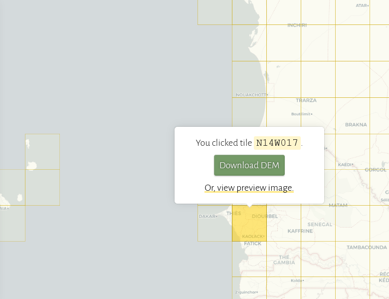
On the interactive map, click a square and select Download DEM to download the data for that tile. Repeat for as many tiles as you need to cover your area of interest. The files download as zipped .hgt (“height”) files.
Processing DEM Data in QGIS
Now we have a folder of zipped .hgt files. They’re easier to process unzipped, so extract the files from the zip archives and load them into QGIS (I’m using version 3.30.0). To make them easier to work with, it’s worth combining them all into a single image, which can be done with the Merge tool under Raster > Miscellaneous > Merge. Select all the layers as input layers and then run the tool with the default settings. You can then save the resulting merged DEM as a .geotiff and remove the individual tiles from your layers list.
Styling
Basic Styling
For very quick styling, you can make a passable hillshade layer by using the hillshade styling for the DEM layer and playing around with blend mode settings.
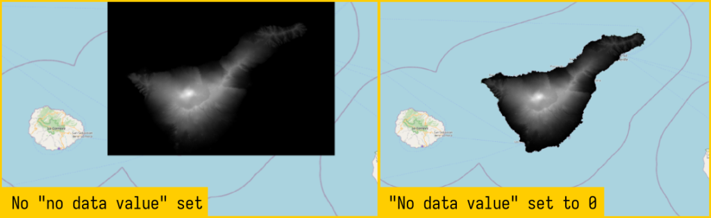
If your area of interest includes sea-level water, you can make it transparent in the layer settings under the Transparency tab – add 0 as the No data value. If your area of interest has a lot of inland sea-level water, this can create an odd effect and you might want to clip the raster using the landmass boundary before continuing.
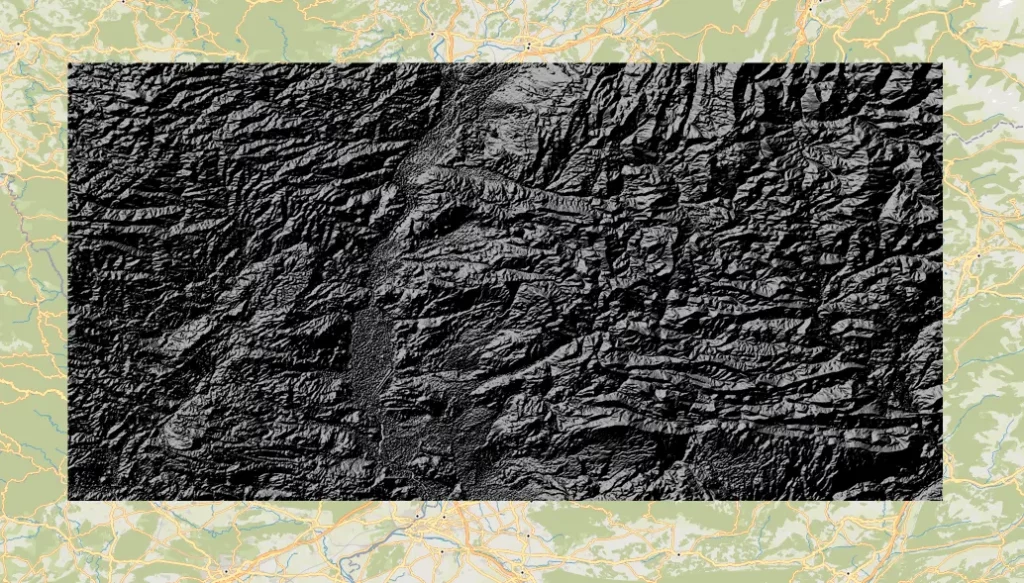
For a basic hillshade, under the Symbology tab, change the Render type to Hillshade and click Apply to update the layer in the main view. You should see something like this, which has clearly defined terrain but also looks very harsh.
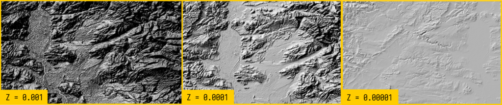
The key to a more natural look – and something closer to ESRI’s terrain layer – is to update the Z Factor field. By default it is set to 1 degree but setting it to 0.00001 (one 100,000th of a degree) will smooth out a lot of the jagged edges. What looks right will depend a bit on the terrain and how much you want to emphasize it – play around the with the Z Factor values until you get something that looks right.
The angle of the sun is set to 315° by default – you can also play with this to fit the location, or select the Multidirectional tickbox, which will apply light from multiple angles.
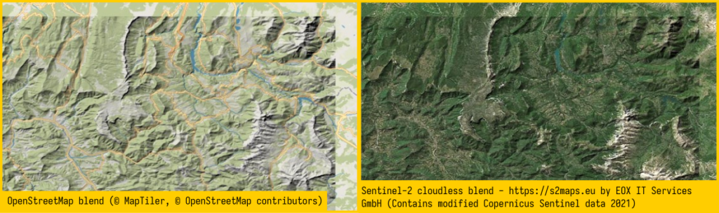
An easy way to use the terrain layer alongside complex information/styling is to set its blend mode to Multiply and move it above the layer with land use or satellite imagery (see other blend modes). OpenStreetMap or Sentinel-2 and easy options to add that have global coverage, but the possibilities are endless. Playing around with brightness, contrast, saturation and gamma can help you fine tune the look.
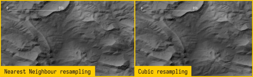
You might find that your layer shows angular artifacts when you view it at lower zoom levels – this can be fixed by changing the resampling method in the layer symbology from Nearest Neighbor to Cubic.
You can now build out your map with additional data with a nice terrain base layer.
Advanced Styling
If you don’t have access to decent satellite imagery, or if it’s too busy and obscures other information you want to show, you can get a good shaded relief effect by duplicating the terrain layer and applying a climate-specific color scale (‘hypsometric tinting‘ or ‘elevation coloring‘).
The basic principle of this technique is that a specific elevation in an arid climate will have a different colour palette to the same elevation in a humid climate. The shading technique is easier to apply where your area of interest has the same climate – otherwise, you need to define the climate zones, apply different styling and then merge them (outlined in the link above).
To do this in QGIS, duplicate the hillshade layer and move it below the original layer. Set the style to Single Band Grey – the default palette is black and white, with black representing lower elevations and white higher.
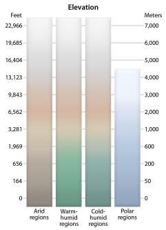
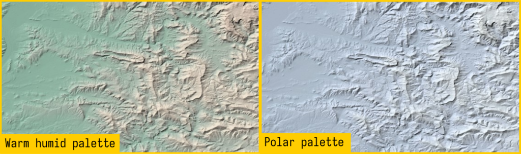
This paper provides a few options of color palettes for different climate zones—arid, warm-humid, cold-humid and polar regions. You could also develop your own by following their methodology for a more specific area.
You can download the palettes in a format that can be imported into QGIS here:
To apply one of the palettes to your DEM, first import the palette (Settings > Options > Colors > Import colors from file). Then open the duplicate layer’s symbology settings. Changing the symbology render type to Single Band Pseudocolor gives lots of options for changing the color palette. You can also manually define the color stops and values. Manually add the number of classes you need based on the range of values in your DEM, then update the values and colors to match the cut points in the elevation color palette. (You can use the imported color palette to make switching colors a bit quicker.)
Once the symbology is applied, you will get the climate-specific coloring combined with the blended hillshade. The images below show the Ventoux area in the warm humid and polar color palettes.
What Else?
There are some more advanced versions of this workflow which use more complex processing than I’ve covered here. In particular, this blog post by Morgan Hite gives a workflow using another piece of software that tries to mimic natural lighting conditions.
If you’re a Mac user, you also have the option of using the Eduard relief shading software, which looks like it produces lovely results but is not available on Windows or Linux.
Known Bug
As of the date of publishing this guide, there is a bug in QGIS that affects exporting raster layers that have blend modes applied if any other layers are using mask effects on symbology or labels. Until the bug is fixed, you’ll need to disable any masks that are set so that the terrain layers export correctly from the map composer.