
An operational timeline is a commonly-requested information product in the early days of an operation. A timeline is usually included in the Operational Plan, SitReps, and other operational documents or meetings. This template is meant for those SIMS colleagues who are new to developing timelines and need a reference, and also to ensure consistent appearance of SIMS products. However, feel free to adapt the template as needed for your product/context, and incorporate your own creativity.
Select one of the formats below to download the template.
Getting information from the requestor
If someone requests an operational timeline from you, try to get as much information as you can from the requestor so that the product meets their needs. Some helpful questions to ask them may include:
- What is the purpose of the infographic?
- Who is the audience?
- Where/how will this be shared? (i.e. in an Operations Strategy, in a joint task force meeting, etc. In other words, will this be needed for a document or a slide deck presentation?)
- What is the deadline?
- What key events do you want included, and what data sources should I use?
- What format/size should it be in? (i.e. portrait or landscape?)
Using the template
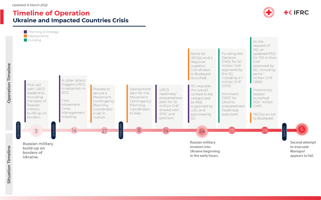
There are many ways that you could create an operational timeline. This template categorizes events in two ways. The operational events are on the top half of the timeline, and the situational events are on the bottom half of the timeline. For example, you can categorize IFRC actions, deployments, funding decisions, etc. as operational events, and conflict-related or disaster-related news and information as situational events. By separating operational events from situational events, the user can more easily see the relationship between events related to the disaster and how the IFRC responded.
The second way that events are categorized in this template are different types of operational events (planning and strategy, deployments, funding, etc), as color-coded as such. You can change the types of operational events based on your context. By color-coding different types of events, the user can more easily visually locate the event types of interest.
If you need to add additional dates to the timeline, you can drag and drop the circle shapes (shown off to the left in the photo below) onto the canvas and add the dates.
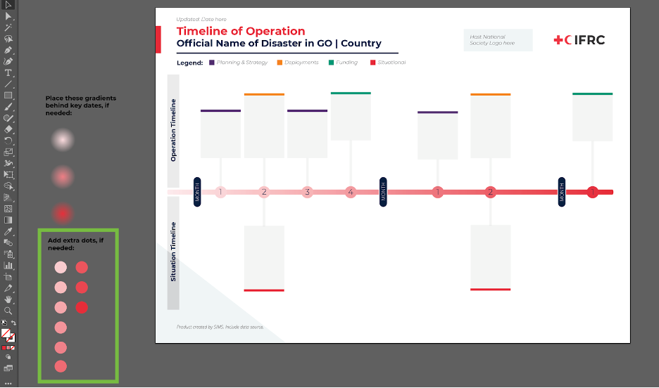
To highlight a more significant event, you can add a gradient circle behind the relevant circle shape on the timeline. The gradient color gives the impression that that date is “glowing”. Examples of these gradient circles are shown off to the left in the photo below, and you can drag and drop them onto the canvas and move them behind the relevant circle shape.
This is one option for highlighting a significant date. If you do not want to use the gradient circles, you might choose to draw a circle line around that date, or make the circle shape for that date bigger.
Timeline best practices
- Try to limit the amount of text you include on the timeline. As an infographic, a timeline is meant to capture key data points, not narrative. If you include too much text on the timeline, it will look visually cluttered and it will be harder for the user to decipher the key messages.
- This timeline is meant to be customizable. If you do not want to show situational events, you can delete the bottom portion of the timeline, leaving more room for situational events.
- Follow the IFRC style guidelines below.
Color Palette
The main colors used in infographics should adhere to IFRC brand standards.
See this article for the colors to use.
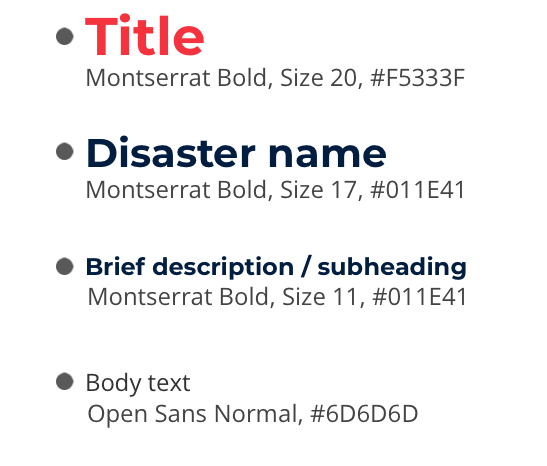
Typography
The main font families used in the IFRC brand standards are shown below. They are available as free downloads from Google Fonts.
In order to maintain a consistent visual style across design products, it is recommended that you adhere to the usage indicated in the example on the right.
You can find the official fonts in this article.
Logos and Icons
The IFRC logo is included at the top-right corner of the infographic. To the left of the IFRC logo, you should add the logo for the Host National Society. The Host National Society logo should always be presented before the IFRC logo, and the two logos should be of equal size.
IFRC has a large library of icons that represent many components of disaster response. Those icons can be found here, in multiple formats (.eps, .ai, .png) and colors (black, white, and red/blue). Please use only these icons in IFRC infographics.