
The Power BI report editor features the ability to add new pages to your report so that your visualizations can be presented in an organized way. The page tabs are seen at the bottom of the report canvas in the Power BI Desktop version, and along the left side Pages panel in the Power BI Online version.
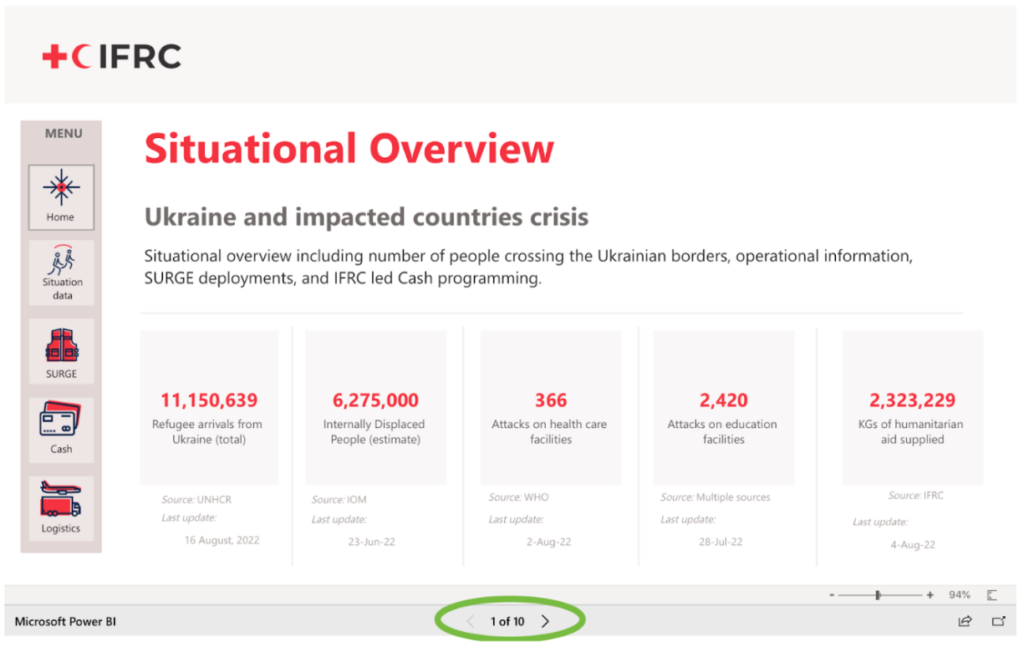
You may be sharing your dashboard on a website, such as the GO Platform, or embedded in a PowerPoint or Sharepoint. If this is the case, the left side Pages panel no longer appears. The user uses the small left and right arrow buttons at the bottom of the screen to navigate from one page to another (see image below). However, the names of the pages no longer appear, making it more challenging for the user to understand how to find the data they are looking for. It also forces them to flip through each page in order to get to the page they are interested in, instead of being able to jump directly to that page. If your report has many pages, the user may spend a lot of time flipping back and forth through the report pages, which is not ideal.
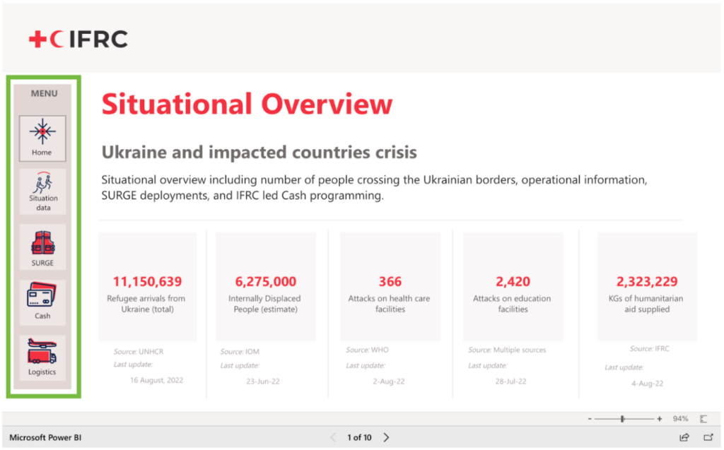
One solution to address the page navigation issue in an embedded dashboard is to include an in-window page navigation menu, as seen along the left side in the image below. There is an out-of-the-box way to add this menu. It is also easy to customize your own navigation menu using a combination of action buttons and inserted shapes. A customized navigation may give your dashboard a more professional appearance that complies with your branding plan. It also will give you more control over designing the user journey, by customizing which pages you want your user to be able to navigate to and when.
Either way, adding this menu onto your report pages will provide a better user experience by allowing the user to quickly navigate to report pages of interest.
Add Pages to your PowerBI Desktop Report
Similar to an Excel workbook, you click on the + symbol on the yellow tab at the bottom of your report window, and this opens a new tab (see below). You can right-click on the tab to rename, hide, duplicate, or delete tabs.

Add an Out-of-the-Box Navigation Menu
- Create some space on your report page along the left side or the top of the page.
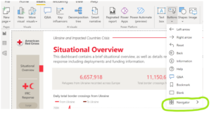
- Select the Buttons feature (in the menu ribbon under Insert), and choose the option for Navigator→Page Navigator (see image on right). This will add a rectangle-shaped button that navigates to each page in your dashboard.
- Using the formatting tool in the Visualizations panel, you can perform some basic formatting of the navigation menu, such as the orientation of the menu, and colors and fonts on the buttons.
Add a Custom Navigation Menu
- Create some space on your report page along the left side or the top of the page.
- Count how many pages you want to include in your menu. You will create a separate button for each page.
- Use the Shapes feature (in the menu ribbon under Insert) to add a shape for the background of your menu. This is optional – you may also choose to not have a background. In Image 4, you can see we chose a light brown colored background for the menu panel.
- Use the Shapes feature again to add shapes to your menu that will eventually act as buttons. This is optional- you may also choose to use text boxes instead of shapes. Either way, add on the same number of shapes/text boxes as corresponding to the number of pages in your dashboard. In Image 4, you can see we added five square shapes to the menu to act as our buttons.
- Label the shapes/text boxes in a clear way so that the user will understand what kind of data they will find on each page of the dashboard. Perform any other stylistic customizations you want to make (i.e. changing color of shapes, changing fonts, adding icons, etc.).
- Locate the Buttons feature (in the menu ribbon under Insert). Choose the option for Blank.
- Drag this shape overtop one of the buttons. Make sure the button is highlighted, and go to the Format panel on the right. At the button of the panel, you will see an option for Action (see image on right). Toggle it to the On position. Under Action, choose the following options:
- Type: Page navigation
- Destination: (Here choose the page you want this button to navigate to).
- Repeat this process with all the other buttons on your menu, starting from adding a blank button, dragging it over top the button in your menu, and choosing the correct page destination from under Action in the Format panel.
- Copy and paste the navigation menu onto each page of your dashboard so that it is in the same position on each page. After you add the menu to each page, make sure to click on each navigation button and check that the Action toggle is turned on and that it navigates to the correct page in your dashboard.
Best Practices
- Organize your report pages in a strategic way. If you group visualizations that are related to a specific topic, or answer similar analytical questions, by page, the user will know what to expect when they go to that page. It will be easier for them to answer their questions if they know how to find what they are looking for. For example, you may choose to keep all your finance-related visualizations on one page, all your staffing visualizations on one page, etc.
- Limit the number of visualizations that you put on each page so as to not overwhelm the user. It is recommended to put no more than 5. If you have more than 5 visualizations that you would like to show, consider how you could separate the visualizations onto 2 pages. For example, instead of 7 small visualizations related to finance on one page, perhaps you could divide them onto two separate pages: Finance (Donor) and Finance (Expenditures).