
By harnessing the power of effective visual communication, you’ll be able to unlock valuable insights and convey your message with clarity to our operational stakeholders and beyond. Modern data visualization tools offer a great degree of flexibility, but by adhering to certain best practices, we can ensure high-quality products with a consistent style.
This guide contains information from the IFRC Data Playbook, 2021 Edition.
- Use Color Strategically: Use colors consistently throughout your reports. If you want to draw your reader’s eye to a certain data point, use an alternate color so that point stands out from the rest. See the color palette SIMS adheres to.
- Label the X and Y Axes: Put a descriptive label on both axes so the reader can cleaerly understand the information presented.
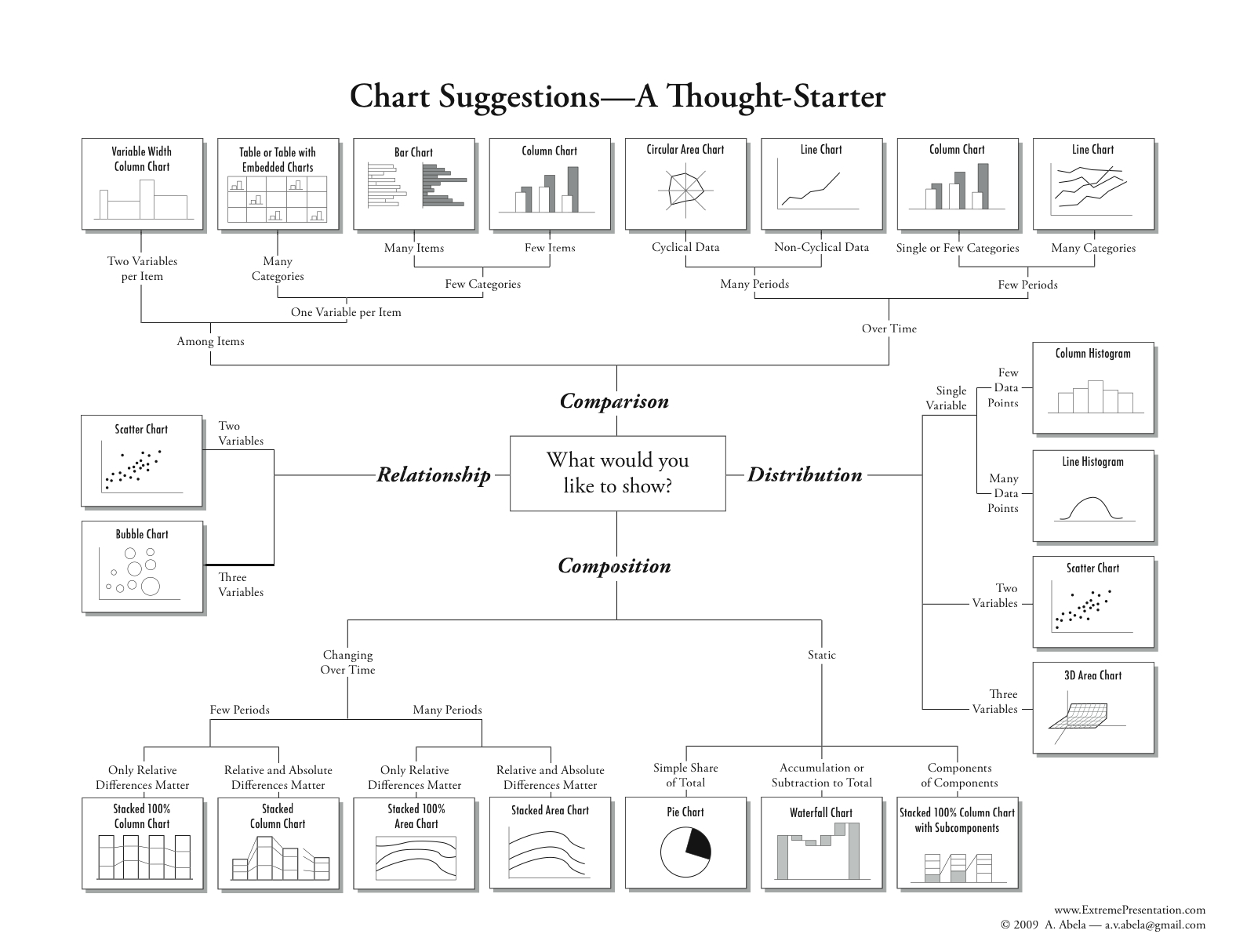
- Use the Correct Chart Type: For example, line graphs are appropriate for showing trends over time, while bar charts are best for comparing different categories. This decision tree is a good resource if you’re not sure where to start.
- Label Lines Directly: If you have more than 3 lines in a line graph, it is easier to interpret if you label the lines directly instead of in a separate legend.
- Use Large Enough Fonts: Make sure your font size is large enough to read easily. We recommend using 9pt font or larger for print documents and 12pt font or larger for PowerPoints.
- Identify Your Data Sources: It is important to cite your data sources so the reader knows how to check your data; this makes your product more trustworthy.
- Do Not Use 3-D Format: When a chart is in 3-D, the data could appear distorted and lead to misinterpretation. Besides, it doesn’t look great!
- Use a Strong Title: Instead of using a generic title, use the space to highlight your chart’s key message. Ensure all chart components come together to highlight your chart’s key messages.
- Put Your Data In Order: Sort your data in a meaningful way: either alphabetically, sequentially, or by value. This will help your reader quickly find the information they need.
- Eliminate Chart Junk: Grid lines, tick marks, borders, double labels, or shading can all distract from your key message.
Tip: In addition to these tips, it’s also a good idea to ensure your data visualization is accessible. See this guide for more information.
Download a printable version of Data Visualization Best Practices
Download a printable version of Data Visualization Best Practices (French)