
You may have noticed that many of the infographics and other information products that SIMS has produced recently have a similar design and format. These products utilize the IFRC color palette and branding, which automatically give them a consistent appearance. They are also formatted in a way that adds to that consistent appearance. This how-to guide describes how to use the IFRC General Infographic Template using Adobe Illustrator.
Select one of the formats below to download the template.
Infographic Production Best Practices
Getting Information from Requestor
If someone requests an infographic from you, try to get as much information as you can from the requestor so that the product meets their needs. Some helpful questions to ask them may include:
- What is the purpose of the infographic?
- What outcome/call to action should be highlighted?
- Who is the audience?
- Where/how will this be shared? (i.e. in an Operations Strategy, in a joint task force meeting, etc.)
- What is the deadline?
- What data sources should I use?
- What format/size should it be in?
Color Palette
The main colors used in infographics should adhere to IFRC brand standards.
See this article for the colors to use.
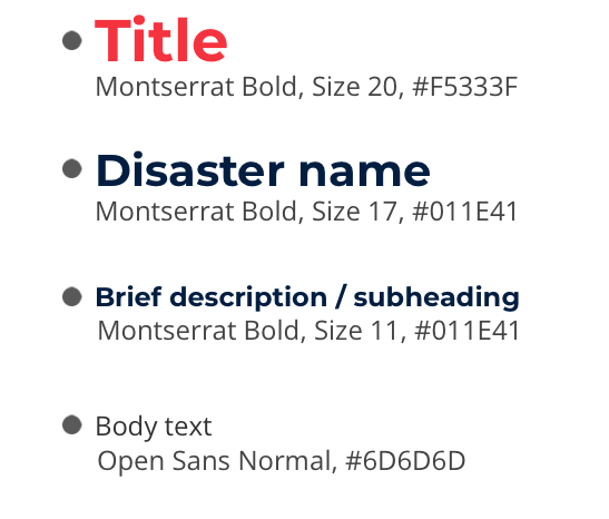
Typography
The main font families used in the IFRC brand standards are shown below. They are available as free downloads from Google Fonts.
In order to maintain a consistent visual style across design products, it is recommended that you adhere to the usage indicated in the example on the right.
You can find the official fonts in this article.
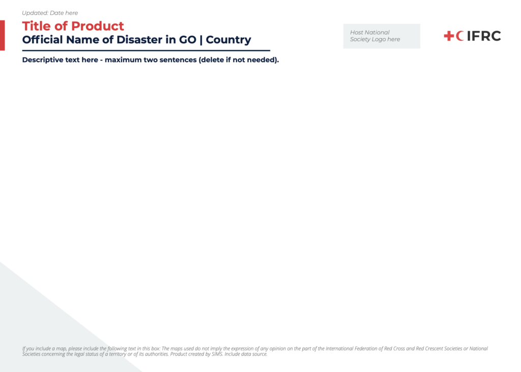
Logos and Icons
The IFRC logo is included at the top-right corner of the infographic. To the left of the IFRC logo, you should add the logo for the Host National Society. The Host National Society logo should always be presented before the IFRC logo, and the two logos should be of equal size.
IFRC has a large library of icons that represent many components of disaster response. Those icons can be found here, in multiple formats (.eps, .ai, .png) and colors (black, white, and red/blue). Please use only these icons in IFRC infographics.
See this article quick links to relevant logos and icons.
Infographic Design Best Practices
Keep these guidelines in mind when developing your infographic.
- Think about your audience. Different audiences have different needs. Consider your audience and the information that would be useful to them.
- Show, don’t tell. Limit the number of words on the infographic. The graphics and data should tell the story.
- Think about the flow. The story you are trying to tell should have a flow, cognitively and visually. Create visual breaks in order to guide your reader’s eye to follow the flow.
- Make sure it is legible. Make sure your font size is large enough to read easily. Try not to use more than two fonts (Montserrat and Open Sans) on one infographic. Don’t use decorative fonts that are hard to read.
- Use colors strategically. Try not to use more than four colors on one infographic. Use brighter colors to draw the eye to key messages or data points. Use correct IFRC branding.
- Focus on one idea. Infographics should capture key information about one main topic. If you have more than one topic, split up the information so each infographic covers one topic.
- Think about dissemination. This template is in A4 size, with horizontal orientation. The person requesting the infographic may have another size that they want. Make sure to ask them before you begin designing your infographic, so you do not have to spend time readjusting the size of all your elements later on. Also, make sure you are using the correct resolution for web or print infographics.
- Remember data visualization best practices. Make sure data is credible, legible, easy to understand, and highlights your key message. Always include the data sources used at the bottom of the infographic.
- Maintain alignment. Your infographic will look more polished and professional if your design elements are aligned. Both Adobe Illustrator and PowerPoint have features that will distribute spacing equally between your elements and align them.
- Select the elements that you want to align and/or distribute equally
- In Adobe Illustrator, click on Window in the menu and select Align.
- In PowerPoint, in the Home tab of the menu, click on Arrange, then Align.
- Practice makes perfect. As you practice more, your infographic skills will improve. Use every infographic as an opportunity to improve on your previous work.
Download a printable version of Infographic Design Best Practices
Download a printable version of Infographic Design Best Practices (French)