
Introduction
A 3W infographic is a commonly-requested product during the first month of an operation. 3W stands for who, what, and where, meaning who are the organizations and National Societies working in the country on the disaster, what are they doing related to the disaster, and where in the country are they doing those activities. A 3W is often updated frequently as new organizations and National Societies begin supporting the disaster and add more sectoral activities across the affected areas. You will often see a 3W in SitReps and operational documents, posted on the GO Platform, and reviewed in Joint Task Force meetings. This tutorial will explain the basic components of a 3W, including how to collect 3W information and how to design your own simple 3W using Microsoft PowerPoint.
What you will need
- Microsoft Powerpoint downloaded on your computer
- 3W infographic Powerpoint template
- IFRC and NS logos and IFRC icons
- Access to 3W activity data
- QGIS downloaded on your computer (optional)
Getting 3W activity data
There are many factors that could influence how much or how little 3W data you will have to work with. Especially during the first few weeks of an operation, there may not yet be a formal system of collecting data from the different sectors and organizations supporting the operation. The IM Coordinator or SIMS Remote Coordinator may suggest administering a simple Kobo survey to the sectoral leads and/or National Societies present to get a basic understanding of who is doing what, where. Once the operation is more established, sectoral leads and/or National Societies present can enter 3W data in the GO Platform, and you can then use the GO Platform as a data source for your 3W infographic.
In the absence of a formal 3W data collection system, you may have to start by scraping 3W data from SitReps and other reports that the operation team is producing. You can use a form such as this to organize the information you are scraping from the SitReps and reports. The most important pieces of information to look for are:
- What response activities are the National Society involved in, and where?
- What response activities are being done by IFRC operation, and where?
- Key situation overview figures, such as number of people affected by the disaster, number of deaths or injuries, number of houses damaged, number of geographical units affected (all of these data points can be modified based on the context of the disaster). Make sure to note the data source you are using for key situation overview figures, and whenever possible to align the figures you are using to those used by the host National Society instead of using figures released by the media.
- How many people or households are being reached by sectoral activities, and where?
Don’t worry if you don’t have much information as you are getting started. The 3W will continue to be updated as new information becomes available.
Adding 3W data to the infographic
Header
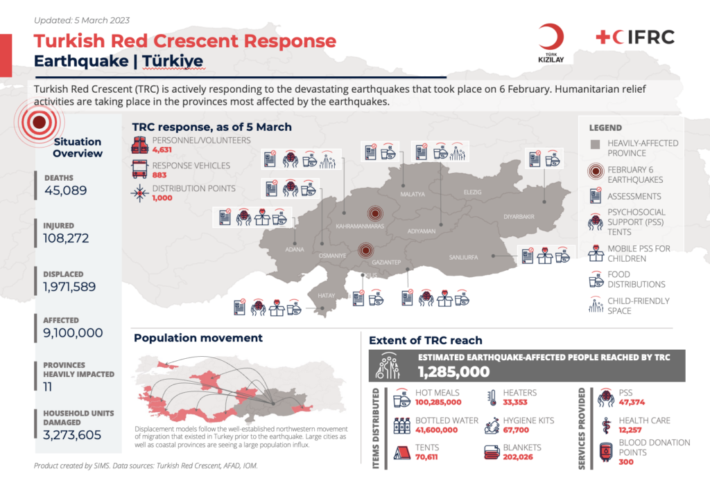
- Add a title (shown here in large red font) to reflect the content of your 3W infographic. Below that, in smaller navy blue font, add the type of disaster the operation is addressing, followed by the country where the disaster took place.
- Below the header, add a short description to provide context for the 3W map. This does not need to be longer than 1-3 sentences. Make sure to include the name of the host National Society as the leader of the operation.
- Add the logo of the host National Society, followed by IFRC’s logo. You can find the logos of all National Societies in this zip file. Align the logos by selecting them both (select more than one logo by holding down the CTRL or Command buttons while you click more than one logo). Then, in your Powerpoint toolbar, go to Picture Format, then Align, then Align Middle.
- Finally, above the title, write the date when your 3W data was last updated. This date should be updated whenever the 3W infographic is updated.
Map
One of the most important components of the 3W infographic is a map of the affected area. Usually this can just be an ADM1 level map, that shows the main regions of the country. However, if you have ADM2 or ADM3 level data on activities, your map should reflect that level of detail.
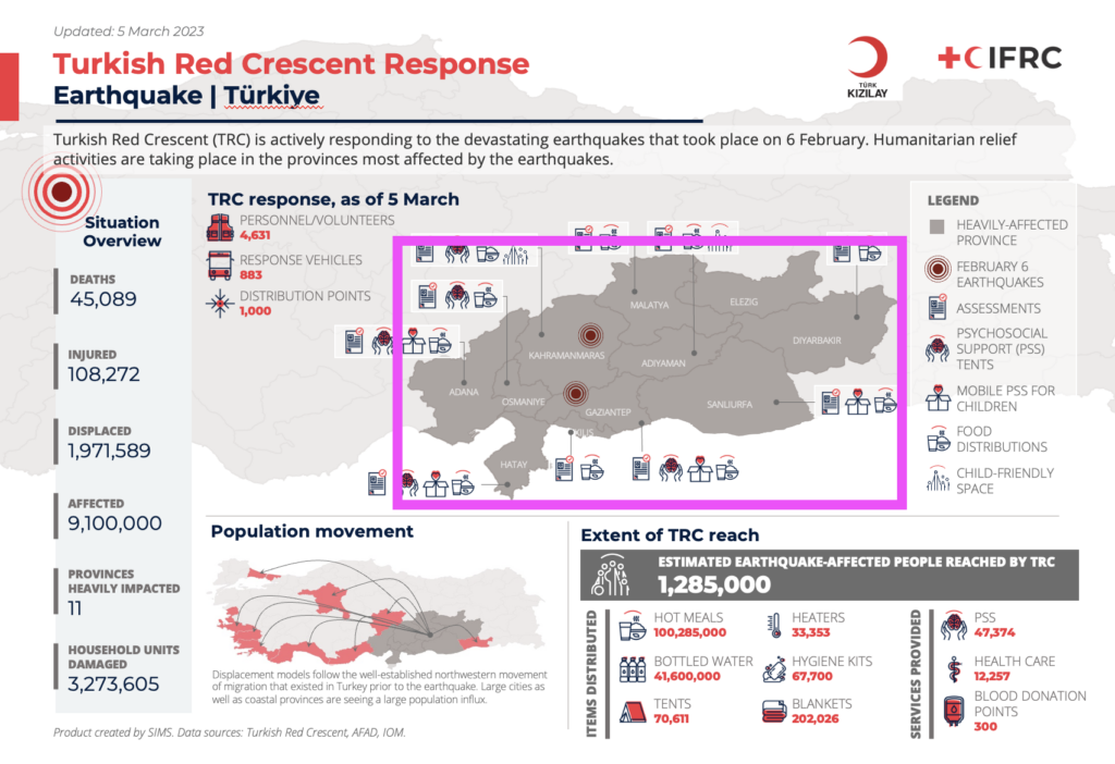
If you are familiar with using QGIS to make a map, you can create your map in QGIS and then export it as an image to add into the Powerpoint template. You may want to consider adding in information to provide context to your map, like highlighting the areas of the country affected by the disaster in a different color than the rest of the country. In this template example, the epicenters of the two major earthquakes were added in QGIS, and the districts most affected by the earthquake are a darker gray than the rest of the country. This will draw the reader’s attention to those areas, and they will not be districted by unnecessary visual clutter on the page.
You can also follow this tutorial if you would like your QGIS map to remain editable in Powerpoint.
If you are not familiar with using QGIS to make a map, you can ask the SIMS Remote Coordinator if they have a simple ADM1 or ADM2 map image that you can use for the infographic.
Adding icons
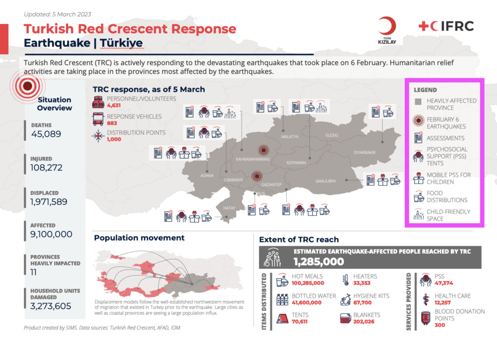
All the icons used in the template can be found in the zip file of IFRC icons. The zip file also contains a Powerpoint file with all the icons indexed to allow for easier locating, copying, and pasting into your infographic.
- Make a legend that includes any necessary map elements, as well as all the icons representing sectoral activities taking place in affected areas.
- Now you can copy and paste the icons into or next to the locations on the map where those activities are taking place. Try not to cover up the geographic boundaries with icons. Instead, draw a line from the location to slightly outside the map of the affected area, and move the relevant icons there.
- To make your infographic look more professional, remember to align your icons. Select all the icons that are grouped together for one location (select more than one icon by holding down the CTRL or Command buttons while you click more than one icon). Then, in your Powerpoint toolbar, go to Picture Format, then Align, then Align Middle. You may also want to select “Distribute Horizontally”, which will evenly space your icons. (Note that you may choose different alignment options depending on the way your icons are oriented).
- Repeat this process of copying and pasting icons from the legend close to the location where those activities are taking place, drawing a line to the location, and aligning the icons.
- Make sure all the relevant locations on the map are clearly labeled and the icons are not covering up the location labels.
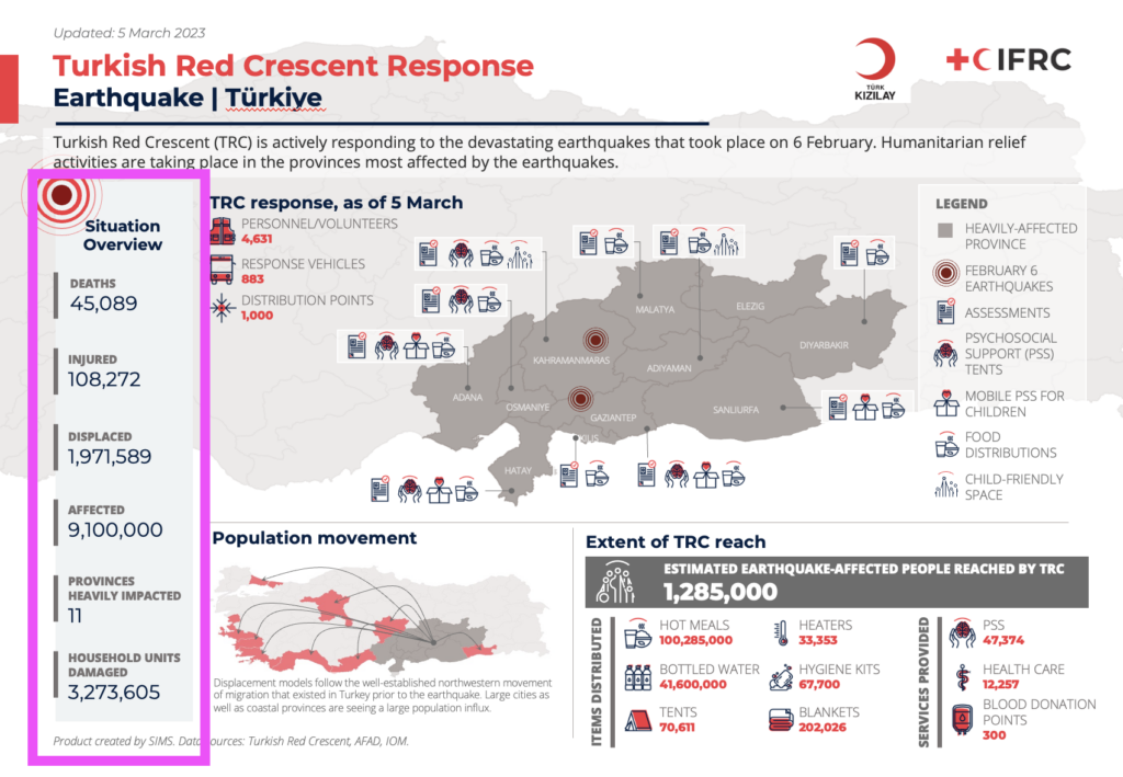
Situation overview panel
In this panel, update the figures that are relevant for the operation. You may need to delete some that are not relevant, or add others that are not included in the template. Make sure that you note your data sources in the footnote below the situational overview panel. Align the text boxes in the panel by selecting them all, and then, in your Powerpoint toolbar, go to Picture Format, then Align, then Align Center. You may also want to select “Distribute Vertically”, which will evenly space your text boxes.
Optional Elements
The space below the map can be used to show whatever information you think is important for your audience. In this example, on the left a smaller map is included to give a sense of where in Türkiye the affected populated was migrating to following the earthquake. On the right we have included data on numbers of affected people reached by various goods and services. If you have this data, it will help to provide some depth to your infographic, as it will connect the audience from the services being provided to how those services are impacting those affected by the disaster. We also added some key figures next to the map to highlight TRC’s outstanding efforts to mobilize following the disaster. If you have similar data about the host National Society, you may wish to include it somewhere on your map.
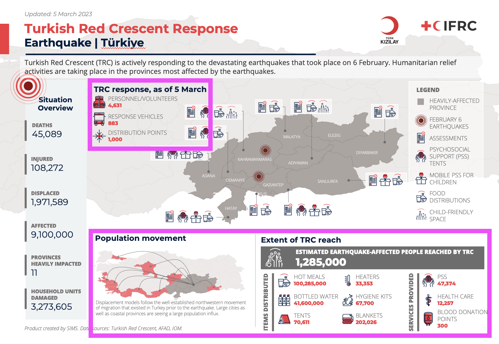
Note that if you have a lot of 3W icons to include on your map, you may not have room for this optional information. Use your best judgment, try not to make the infographic too cluttered, and only include visualizations that are meaningful for the context of the operation you are supporting!
1 Comment